
What a chart knows, and when it knows it
Technical-analysis charts can be remarkably persuasive. A price turns upward near the lower edge of a channel. An oscillator rising from an ‘oversold’ region. A marker appears almost perfectly underneath a historical trough.
Viewed after the fact, the chart seems to explain what happened and perhaps even to have anticipated it.
But those are two very different achievements. A chart component may:
- Display raw market activity;
- Transform or smooth historical observations;
- Measure momentum or volatility;
- Confirm a condition using only information available at that moment;
- Identify a turning point retrospectively;
- Or contribute to a strategy evaluated under realistic execution assumptions.
Although basically different, these categories are often blurred together. A visually accurate description of history may be mistaken for a live trading signal, while a causal indicator may be described as forecasting even though it predicts no future price.
This article uses the shared hdw_crypto_data and hdw_stock_data showcase as an experimental instrument. It combines market observations, momentum indicators, volatility channels and trend-smoothing methods.
It also asks the question every technical-analysis chart should answer: At what moment did this information actually become knowable?
What is Technical-Analysis?
Technical analysis, commonly abbreviated to TA, studies market-generated data, principally price, volume and trading activity—to identify trends, momentum, volatility, recurring structures and possible changes in market behaviour.
We call it technical analysis because it concentrates on the observable behaviour of the market itself rather than primarily investigating the fundamental value of the underlying company or asset.
Fundamental analysis might examine revenue, margins, competitive position, cash flow or valuation. Technical analysis instead asks questions such as:
- Is the market trending?
- Is that trend strengthening or weakening?
- How volatile is the price?
- Is participation expanding?
- Is price moving unusually far from its recent baseline?
- Has a possible reversal been confirmed?
- Would the same rule have worked when tested across unseen periods?
Technical analysis commonly uses historical price and volume to identify patterns, trends and momentum changes that may inform possible entry or exit decisions.
The final word is important: possible. An indicator transforms historical observations. It does not eliminate uncertainty, establish fundamental value or guarantee that a previously observed relationship will persist.
Start with observations, not indicators
Before calculating RSI, Keltner Channels or any other derived value, the analytical system begins with basic market observations.
Price
For candlestick data, we represent the price by four values per interval: open, high, low, close. Together, these describe the trading range and the movement between the beginning and the end of the interval.
Volume
Volume measures the reported quantity traded during the interval. It can help distinguish a price movement accompanied by expanding participation from one occurring with relatively little activity.
Its exact meaning depends on the provider and market. Crypto-exchange volume and exchange-traded equity volume do not necessarily have identical coverage or construction.
Number of trades
Some providers report how many individual trades contributed to a candle. Binance data can contain this value. Yahoo’s chart endpoint does not provide an equivalent trade count through the interface used by hdw_stock_data. The shared DataFrame therefore represents an unavailable Yahoo trade count as missing—not as zero.
That distinction illustrates an important principle: a standardized analytical interface should preserve unavailable information as unavailable rather than inventing equivalence between data sources.
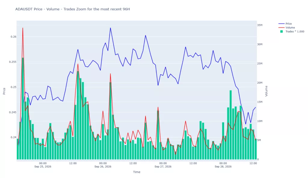
Figure 1. The analytical starting point, Price, volume and transaction count are observations. Technical indicators derive new representations from these same historical measurements.
Candlesticks are representations, not indicators
A candlestick maps the open, high, low and close of one interval. Its body shows the distance between open and close. Its wicks show movement beyond that body. A large body can indicate substantial directional movement during the interval, while a long wick can show that price moved into an area but did not close there.
Candlesticks provide a compact visual description of price action, but they are not independently a momentum oscillator or predictive model. A large green candle may reflect strong buying pressure—but it may also occur near the end of a move. A long lower wick may indicate rejection of lower prices—but its interpretation depends on the preceding trend, volume, volatility and subsequent candles.
The candlestick is therefore the observation layer. Momentum and channel indicators transform those observations into additional analytical views.
Families of technical indicators
It is tempting to place every line shown on a chart under one heading. A more useful classification distinguishes what each component actually measures.
| Component | Primary role | What it describes | Typical interpretation |
| Candlesticks | Price representation | Open, high, low and close | Direction, range and intrabar rejection |
| Volume | Participation | Reported traded quantity | Strength or weakness of participation |
| Number of trades | Activity | Count of contributing trades | Frequency of market activity |
| RSI | Momentum oscillator | Speed and magnitude of recent price changes | Momentum regime and possible extremes |
| Stochastic Oscillator | Momentum oscillator | Close relative to its recent high-low range | Position and turning behaviour within a range |
| Moving average | Trend filter | Smoothed historical price | Direction and distance from a baseline |
| Schaff Trend Cycle | Cyclical momentum indicator | MACD-derived trend information transformed through a stochastic calculation | Potential acceleration, deceleration or cycle transition |
| Bollinger Bands | Volatility envelope | Moving average plus standard-deviation bands | Relative price position and volatility expansion or contraction |
| Keltner Channels | Trend/volatility envelope | Moving average plus ATR-derived bands | Trend baseline and volatility-adjusted displacement |
| Gaussian-smoothed bands | Historical smoothing structure | Smoothed price and implementation-specific envelopes | Retrospective trend and turning-point interpretation |
This classification prevents two common mistakes: treating every visual component as a trading signal, and, combining multiple indicators that merely transform the same price information in similar ways. Two correlated momentum oscillators do not necessarily provide two independent confirmations.
Momentum Indicators
Momentum indicators attempt to quantify the speed, persistence or strength of price movement.
They can help describe whether upward or downward movement is accelerating, weakening or reaching a historically unusual state. They do not prove that a reversal must follow.
Relative Strength Index
The Relative Strength Index, or RSI, is a bounded oscillator ranging from 0 to 100. It compares the magnitude of recent upward and downward price changes. RSI is commonly interpreted using reference levels:
- Above 70: conventionally described as overbought;
- Below 30: conventionally described as oversold;
- Around 50: broadly balanced recent momentum.
RSI measures the speed and magnitude of price changes and is widely used as a momentum indicator. These thresholds should not be interpreted mechanically. ‘Overbought’ does not mean that price must immediately fall, and ‘oversold’ does not mean that it must immediately rise. During a strong trend, RSI can remain in an extreme region for an extended period.
A move above 70 may therefore mean either momentum has become stretched and may reverse, or, the market has entered an unusually strong upward regime. Context and confirmation determine which interpretation is more plausible.
Stochastic Oscillator
The Stochastic Oscillator compares the latest close with the high-low range over a selected lookback period.
Its principal lines are %K: the faster oscillator that responds immediately to the latest price action and fluctuates rapidly between 0 and 100, and, %D, a moving average that reacts more slowly and smoothly which helps filter some of the short-term variation and false signals from the fast %K line. The indicator therefore asks where the market closed relative to its recent range.
Note: ‘D’ and ‘K’ don’t have any special meaning. George Lane, who invented this indicator, experimented with several related formulas: D was the fourth and K happened to be the eleventh.
Traders often examine crossovers between %K and %D, movements into or out of extreme regions, divergence between the oscillator and price and whether the market is ranging or strongly trending.
Crossovers can occur frequently and are not inherently reliable turning points. Stochastics are generally easier to interpret in broad trading ranges or relatively slow trends than during persistent directional moves.
Moving Averages
A moving average smooths historical price observations over a selected period.
A Simple Moving Average (SMA) gives the included observations equal weight.
An Exponential Moving Average (EMA)gives more weight to recent observations.
Moving averages are principally trend filters, although distance from an average and changes in its slope can also communicate aspects of momentum.
Common interpretations include:
- Price above a rising average: upward trend context;
- Price below a falling average: downward trend context;
- Price crossing an average: possible regime transition;
- Short and long averages crossing: possible change in trend direction;
- Increasing distance from the average: stronger displacement, but also possibly an increasingly extended move.
- Because a moving average is calculated from historical observations, it necessarily reacts after price changes. Reducing the lookback makes it more responsive but also more sensitive to noise.
Schaff Trend Cycle
The Schaff Trend Cycle, or STC, combines MACD-derived trend information with a stochastic-style transformation. STC is designed to combine MACD-derived trend information with stochastic-style cycle processing, with the aim of responding to cyclical transitions more quickly than a conventional MACD presentation. It is normally plotted as a bounded oscillator. The Moving Average Convergence Divergence is a popular, trend-following momentum indicator that shows the relationship between two moving averages (EMA) of a price.
Possible interpretations include:
- Movement out of a low region as improving momentum;
- Movement down from a high region as weakening momentum;
- Changes in direction as possible cycle transitions.
However, an extreme STC value does not prove that momentum is exhausted. Nor does an STC reversal combined with a channel touch automatically constitute a strong reversal signal.
We should treat that combination as a testable rule. When price reaches a volatility-adjusted extreme and cyclical momentum changes direction, does the probability or magnitude of a subsequent reversal improve?
The answer must come from properly separated historical testing, not from the visual attractiveness of selected examples.
Volatility and trend channels
Channels place price in relation to a changing centre and outer boundaries. They help answer two related questions: where is the price now relative to its recent trend, and, is its displacement unusual relative to its recent volatility?
Note. The outer lines of channels are not real barriers. Prices can cross them and still continue moving in the same direction.
Bollinger Bands
A conventional Bollinger Band construction uses 3 lines:
- a Simple Moving Average as the centre line;
- an upper band with a fixed number of standard deviations above it;
- a lower band with the same number of standard deviations below it.
Because standard deviation expands and contracts with price variability, the bands widen during more volatile periods and narrow during calmer periods.
An interesting condition of Bollinger bands is the so-called ‘squeeze’. When the bands become unusually narrow and volatility has contracted, this is commonly called a squeeze. It does not mean that upward or downward momentum is secretly accumulating, nor does it reveal the direction of a future breakout. It just indicates that distribution of prices has become compressed.
If volatility subsequently expands and price leaves that compressed region, the move may become analytically interesting. Direction and confirmation still need to come from price, volume or other independently useful evidence.
Bollinger Bands with RSI or Stochastic
Adding a momentum oscillator to a band position can provide context. Price near an outer band describes unusual relative displacement, RSI or Stochastic describes recent momentum and candlesticks and volume may show how price behaves at that location.
However, a price reaching or crossing the upper band while RSI exceeds 70 is not automatically a sell signal. Strong trends can repeatedly move along or beyond an outer band while RSI remains elevated.
Charles Schwab & Co, the financial services firm that provides educational resources on Bollinger Bands, explicitly cautions against taking action solely because a price touches a Bollinger Band and suggests waiting for additional price patterns or supporting evidence.
Keltner Channels
Modern Keltner Channel implementations commonly use an Exponential Moving Average as the centre line and an Average True Range-derived distance for both the upper and lower channels. Our showcase charting application uses this EMA-and-ATR interpretation.
Unlike Bollinger Bands, which use standard deviation, Keltner Channels use the ATR to create smoother, more consistent volatility envelopes, responsive to the recent trading range, while the EMA also supplies a smoothed trend baseline.
Compared with standard-deviation-based Bollinger Bands, Keltner Channels generally react differently to volatility shocks because they measure dispersion differently. A position near or outside a Keltner Channel can indicate strong directional displacement, a potential breakout, a temporarily extended move or the beginning of a mean-reversion setup.
The channel alone does not decide which interpretation is correct.
Combining indicators: confirmation or duplication?
Combining signals can improve an analytical rule when the components contribute meaningfully different information. For example:
- A channel describes volatility-adjusted price location;
- RSI describes recent momentum;
- Volume describes participation;
- A candlestick describes the behaviour of price within one interval;
- A moving average provides trend context.
A possible research condition might therefore be a price closes below the lower Keltner Channel, subsequently returns inside it while RSI begins recovering from a low region and volume is not collapsing. This is much more informative than simply combining RSI and Stochastic because those two oscillators may encode overlapping information from the same price series.
The objective is not to collect as many confirmations as possible. It is to combine complementary evidence while avoiding unnecessary duplication and parameter fitting.
Advantages of combining signals
Combining complementary signals may strengthen an early hypothesis but can also constitute a warning against overoptimism. It helps to reduce reliance on one noisy transformation, aids in separating real trend context from entry timing or distinguishing displacement from participation. Thus, it may make a rule explicit enough to test but on the other hand can also expose disagreements between indicators.
Risks of combining signals
We should guard against adding multiple versions of the same (kind of) information or fall for hindsight-based parameter selection, overfitting an asset. Also, visual attractiveness can constitute a pitfall by making a strategy look sophisticated without making it robust. A larger indicator stack is not automatically a better model.
Using the Showcase as an experimental instrument
The shared showcase in the repositories of both market-data providing packages allows the same analytical layer to be applied to compatible crypto and stock DataFrames.
That creates a useful environment for comparing asset categories, crypto versus equities and continuous markets versus exchange sessions. But also, high- versus low-volatility assets and trending versus ranging periods. Finally, further derived comparisons like raw observations versus derived indicators or causal signals versus retrospective annotations.
The purpose is not merely to produce attractive charts. It is to turn chart interpretation into explicit, inspectable logic.
For every displayed marker, the application should make four things clear:
- What is the input, which observations have we used?
- What is the nature of the calculation, is the transformation causal or retrospective?
- What is the confirmation, when did the condition become knowable?
- What about the execution, what is the earliest realistic price at which a strategy could have acted?
This framework is useful because it reveals an important difference between the showcase’s Keltner logic and its Gaussian turning points.
Keltner confirmations: causal, but not predictive
The Keltner strategy is causal when every calculation at candle t uses only observations available at or before t.
A confirmed lower-channel re-entry can be expressed as:
buy_confirmation = (
        (close.shift(1) < lower_channel.shift(1))
        & (close >= lower_channel)
)Listing 1. Confirmed lower-channel re-entry
This means the previous candle closed below its corresponding lower channel, and, the current candle closed back at or above the current lower channel. There is no reference to candle t+1 or any later observation. At the close of candle t, the confirmation genuinely exists.
But the method is not forecasting in the strict sense. It does not calculate a future price or establish that price must subsequently rise. It detects a present condition: price previously closed below its volatility-adjusted range and has now returned inside it. That condition may support a testable mean-reversion hypothesis. Whether it has predictive value is an empirical question.
Confirmation is not execution, even a causal signal can be presented misleadingly. If the marker is plotted at the close that confirms the condition, it should be labelled: ‘Buy confirmation’ not simply: ‘Buy’.
The closing price is the value that made the condition knowable. A conservative backtest should normally simulate execution no earlier than the next tradable event, for example, the open of the next candle. The timing sequence is:
| Event | Earliest timestamp |
| Lower-channel breach | Candle t-1 close |
| Re-entry confirmation | Candle t close |
| Conservative simulated execution | Candle t+1 open |
This prevents a backtest from claiming an execution price that was only known after the confirming candle had completed.
Gaussian turning points: useful history, unavailable in real time
The Gaussian implementation serves a different purpose. Gaussian smoothing applies a weighted kernel around each observation. In the showcase, SciPy’s standard gaussian_filter implementation uses a centred kernel whose size extends on both sides of an observation. The documented kernel size is 2 * radius + 1, reflecting this neighbourhood around each point.
For a historical point, the smoothed value therefore depends not only on earlier observations but also on later neighbours. Consequently, smoothed historical peaks and troughs can be identified cleanly, short-term noise can be suppressed, a trend structure can become easier to interpret, but the historical value could not have been calculated in that form at the time. This is future leakage when used as though it were a live trading signal.
A Gaussian marker should therefore not be labelled simply Buy/Sell (or Entry/Exit).
More honest labels are Gaussian-smoothed retrospective trough/Gaussian-smoothed retrospective peak or historical turning point. The marker shows where a turning point was, not when that turning point became knowable.
Keltner versus Gaussian: two different analytical jobs
| Keltner confirmation | Gaussian turning point |
| Causal | Retrospective |
| Uses present and past observations | Uses observations on both sides of a historical point |
| Can be calculated after the current candle closes | Cannot reproduce the final historical marker at that moment |
| Identifies a current channel condition | Describes smoothed historical structure |
| Signal-oriented | Interpretation-oriented |
| Can support a testable strategy hypothesis | Can support historical labelling and visual analysis |
| Requires next-bar execution assumptions | Must not be backtested as if it were a live signal |
| May be wrong about what follows | Can look accurate because later observations contributed to it |
The distinction is not that Keltner Channels are ‘good’ and Gaussian smoothing is ‘bad’. They solve different problems. Keltner logic can generate causal confirmations, but those confirmations may still have little or no predictive value. Gaussian smoothing can reveal historical structure extremely well, but the symmetric version cannot honestly claim contemporaneous detection. The problem occurs when one analytical job is presented as the other.
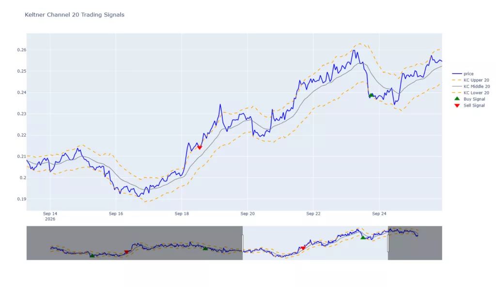
Figure 2. A causal Keltner method. The channel and its confirmations are calculated from current and earlier bars. A marker can therefore be reproduced at the historical point at which the required information became available—although profitability still requires separate execution and backtesting rules.
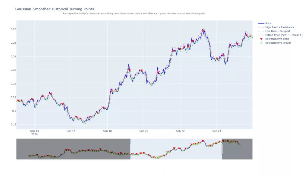
Figure 3. Retrospective Gaussian structure. Symmetric smoothing uses observations on both sides of a historical point. Its peaks and troughs can describe past market structure clearly, but they cannot be treated as signals that were available at those exact moments.
From visual evidence to a testable strategy
A chart becomes a research instrument when its visual rules are converted into explicit calculations. For a proposed strategy, that means defining a complete context:
- Exact input columns;
- Indicator formulas and parameters;
- Warm-up requirements;
- Raw signal conditions;
- Position-state rules;
- Treatment of unfinished candles;
- Confirmation timestamps;
- Execution assumptions;
- Fees, spread and slippage;
- Missing-data policy;
- In-sample and out-of-sample periods;
- Assets and market regimes tested.
The evaluation should report all raw conditions as well as the filtered trades that remain after position management. Otherwise, an apparently selective strategy may simply be hiding how frequently its underlying condition occurred.
Testing should also compare plausible alternatives. For the Keltner example:
Aggressive bounce:
aggressive_buy = (
        (close.shift(1) < lower_channel.shift(1))
        & (close > close.shift(1))
)Listing 2. Aggressive bounce
This identifies the first upward close after a lower-channel breach.
Confirmed re-entry:
confirmed_buy = (
        (close.shift(1) < lower_channel.shift(1))
        &  (close >= lower_channel)
)Listing 3. Confirmed buy
This waits for price to return inside the channel.
The aggressive version responds earlier but may accept more weak bounces. The confirmed version responds later and less frequently but has a clearer relationship to mean reversion. Neither should be declared superior based on one chart. They should be compared across multiple assets, periods and market regimes using the same execution assumptions.

Figure 4. A visual pattern becomes a strategy only after its calculation, state, timing and execution rules are made explicit.
What technical analysis can and cannot tell us
Technical analysis can structure market observations. It can measure momentum, smooth trends, normalize price displacement by volatility and turn discretionary visual ideas into explicit rules. It can also expose when different markets behave differently despite sharing the same DataFrame structure.
What it cannot do is eliminate uncertainty. A technically sound chart should therefore distinguish:
- Observation from interpretation;
- Description from prediction;
- Confirmation from execution;
- Causal computation from retrospective smoothing;
- A visually plausible rule from an empirically supported strategy.
That distinction is more valuable than another supposedly perfect indicator.
The most important question is not: Does this marker appear close to the historical bottom? It is: Could this exact marker have been calculated at that moment—and at what price could anyone realistically have acted on it?
Once a chart answers that question honestly, technical analysis becomes less magical, but considerably more useful.
The indicators and showcase discussed here are research and educational tools. They do not constitute trading or investment advice. Historical patterns, causal signals and retrospective turning points do not guarantee future results.
Ask a Question or give Feedback about this article